
Society
A Note From Our Publisher, Sophie Banford
Make it pop!
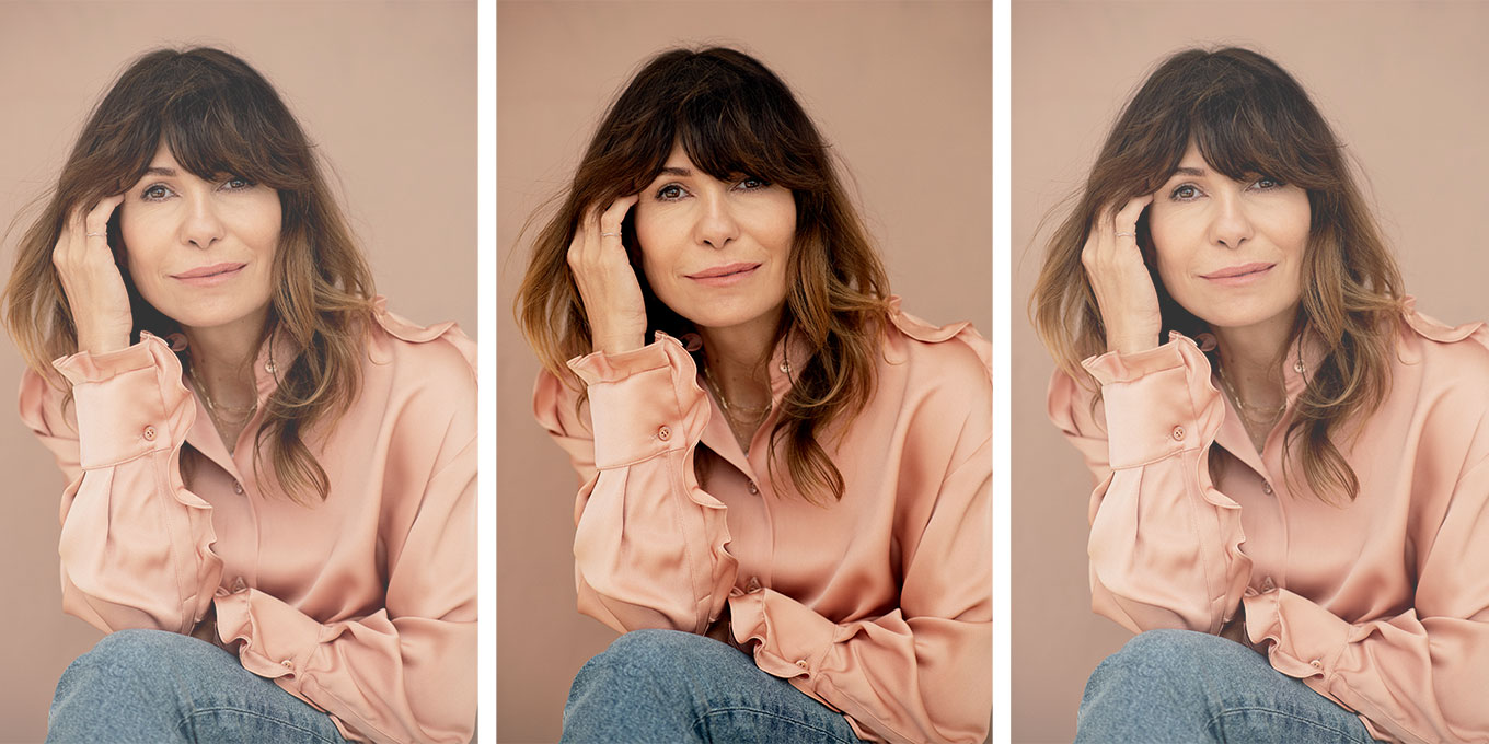
Andréanne Gauthier
I’m probably not the only one who has noticed that since we’ve emerged from our pandemic lairs, vibrant colours have been all the rage—both in home decor and fashion. It’s as if after two grey years, we all need to shake ourselves up in every way possible. And why not do that by choosing shades that invigorate our moods as well as our complexions?
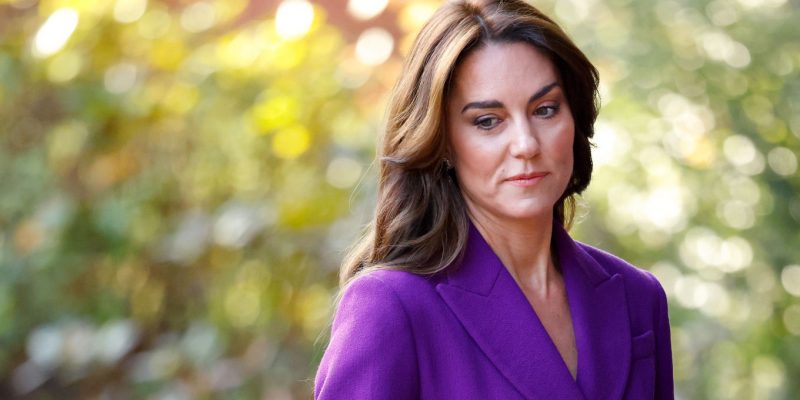
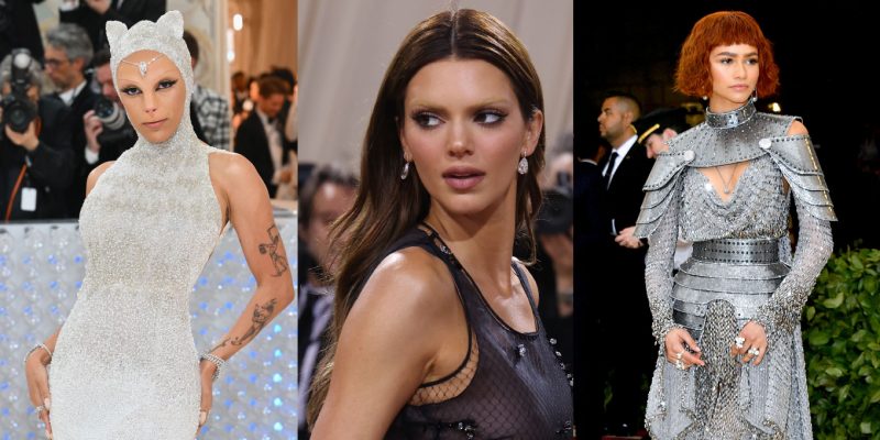
Think, for example, of the hyper-electric pink that we’re seeing everywhere right now (including on this issue’s cover). Valentino’s artistic director, Pierpaolo Piccioli, made it the main theme of his fall/winter 2022/2023 show, and it will be added to Pantone’s official colour scale as “Pink PP” in honour of the Italian luxury house. This hard-to-miss shade has been seen at all the big events lately, from the Met Gala to the Grammy Awards, and worn by everyone from Zendaya to Glenn Close. And its ubiquity is heartening.
View this post on Instagram
Pablo Picasso once said, “Colours, like features, follow the changes of the emotions.” In 2021, during the height of the pandemic, Pantone chose “Ultimate Gray” as one of its two colours of the year, so it makes sense that as we enter a bolder, more hopeful era, we’re embracing brighter hues. In the realms of both fashion and interior design, colour can strongly affect our sensibilities and moods. According to the psychology of colours, warm shades—especially pinks—stimulate exciting emotions. Can one wear hot pink from head to toe and also be full of gloom? Probably, but it must be a lot harder to pull off.
While I know we won’t solve the world’s problems with a Pink PP dress, if a fuchsia sweater can infuse a little positive energy into your day, then why not wear it? As someone whose wardrobe is full of black, I am going to try to change things up this season with some colourful pieces that will help me say to the universe “Give me what you’ve got—I’m ready for you.”
 Brent Goldsmith
The October 2022 issue of ELLE Canada is available on newsstands now, in print and digitally.
Read more:
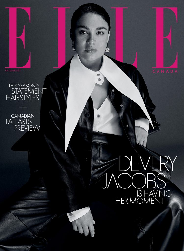
An Effortlessly Cool Devery Jacobs Graces ELLE Canada’s October 2022 Cover
Devery Jacobs Is the Leader of the Pack
The Top Fashion Trends for Fall-Winter 2022-2023
Newsletter
Join our mailing list for the latest and biggest in fashion trends, beauty, culture and celebrity.

Read Next
Beauty
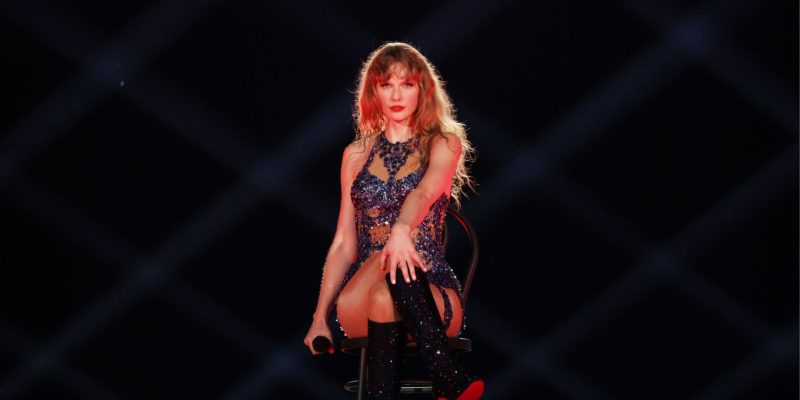
The Best Met Gala Beauty Looks Of All Time
From Taylor Swift's 'Bleachella' era to Rihanna's iconic 2011 braids, meet the best beauty moments in Met Gala history.
Culture
Benny Blanco Says He Fell in Love With Selena Gomez Without ‘Even Noticing’ It
Allow Benny Blanco to tell the straight-from-a-rom-com story of how he realized his feelings for his girlfriend and longtime friend.

Culture
This University Elevates Women to New Professional Heights
You shouldn’t have to pause your life to move forward in your career.